
Beyond the Hockey Stick, Looking at Climate Change Today
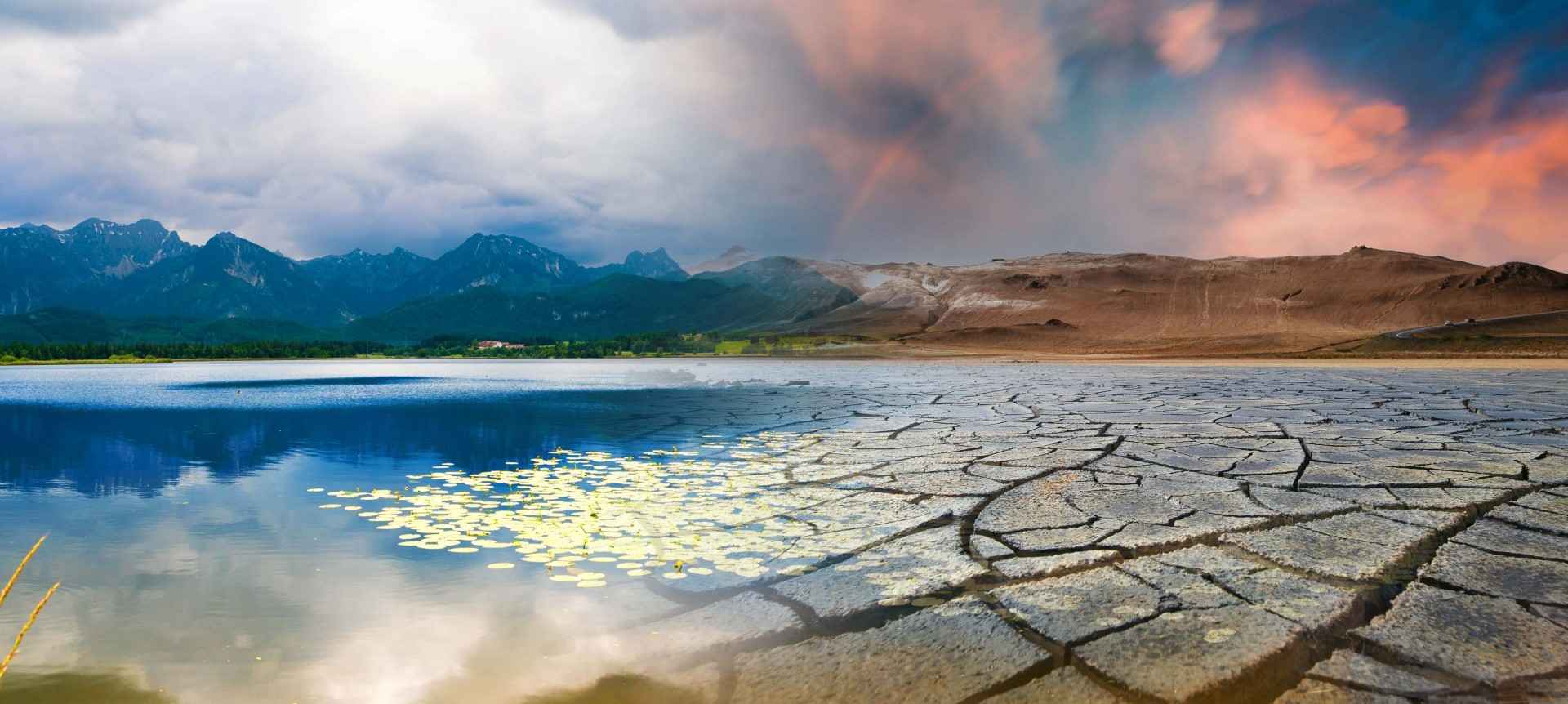
The Badwater Basin salt flats in California’s Death Valley National Park, once a vast expanse of dry land, temporarily transformed into a lake due to flooding from Tropical Storm Hilary in August. On October 23, 2023, the remnants of this transformation were still visible, a stark reminder of the unpredictable nature of our changing climate.
Michael E. Mann, a distinguished professor of atmospheric science and director of the Earth System Science Center at Penn State University, and author of the recently released book The New Climate War: The Fight to Take Back our Planet, shares his insights.
Get it on Amazon here.
On Earth Day, April 22, 1998, during the warmest observed year at that time, my co-authors and I introduced the “hockey stick” curve to the world through publications like the New York Times. This graph, based on proxy climate data including tree rings, ice cores, coral, and lake sediment, illustrated the average temperature of the northern hemisphere over six centuries, resembling a hockey stick. It’s “handle” represented the relatively stable pre-industrial temperatures, and the “blade” showed a significant warming trend beginning with the Industrial Revolution.
Evolution and Impact of the Hockey Stick
A year after its introduction, we extended the hockey stick graph to cover the last millennium, further highlighting the unprecedented nature of contemporary warming. The hockey stick graph has withstood criticism and numerous obstacles, primarily from fossil fuel interests, and other scientific teams have confirmed and expanded on it.
The Need to Look Beyond
Nearly two and a half decades later, the signals of planetary warming are unmistakable, as evident in the extreme weather events of recent times. This makes it imperative to look beyond the hockey stick graph and delve into what the climate record of the common era can teach us about our current climate crisis.
The hockey stick graph provides a hemispheric average, potentially obscuring larger regional climate events. An example is the El Niño phenomenon, a natural climate pattern with significant global impacts. Current reconstructions based on proxy data suggest a connection between volcanic eruptions and El Niño events, a relationship not adequately represented in current climate models. This means that predictions about how El Niño will change because of climate change might not be as accurate as they should be. This could have big effects on how hurricanes and droughts happen.
Ocean Currents and Climate Thresholds
The “great ocean conveyor” is another critical climate component, with potential slowing down projected for later this century. However, paleoclimate data suggests this slowdown may already be underway, highlighting the urgency of addressing climate change. Additionally, reevaluating climate models and proxy data from the common era indicates we may be closer to dangerous warming thresholds than previously thought, necessitating more ambitious solutions.
Final Thoughts
While the “hockey stick” graph highlights the stability of our climate over the common era, emerging evidence suggests that we are rapidly departing from this stable climate period. It is imperative that we act swiftly and decisively to preserve our fragile climate stability and avert impending climate catastrophe.